


Shirt Design – Print Simplification Methods
Achieving Impactful Shirt Design on a Budget: Creative Solutions
A standout t-shirt design that grabs attention without breaking the bank is a challenge many creators face. The cost of printing can shoot up with intricate designs, especially when using multiple colors. However, with a bit of creativity and smart choices, you can achieve a visually striking design while staying within your budget.
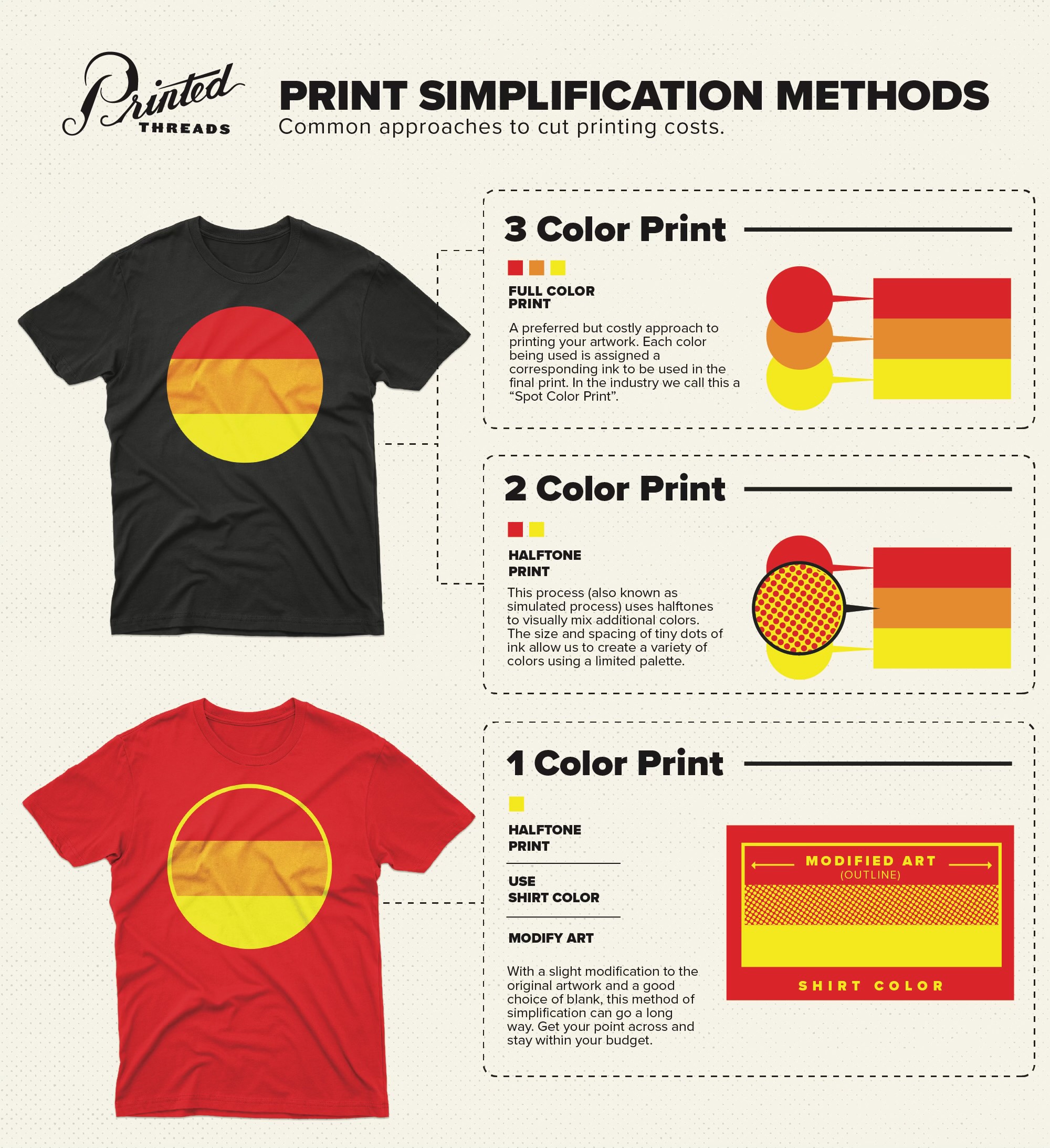
In the above graphic, we start off with a 3-color print, but are able to pare down to a 2-color and even a single-color print through two effective methods: halftone printing and strategic use of shirt color.
Halftone Printing: Maximizing Impact with Minimal Colors
Halftone printing, also known as simulated process printing, is a powerful technique for reducing the number of colors used in a design without sacrificing its visual appeal. This method involves printing tiny dots of varying sizes and spacing, which blend together to create the illusion of multiple colors and shades.
How It Works:
- Dot Patterns: Halftone printing utilizes dots of different sizes and densities. Larger dots create darker areas, while smaller, more spaced-out dots form lighter regions.
- Color Blending: By strategically positioning dots of primary colors (typically cyan, magenta, yellow, and black), you can simulate a wide range of hues and gradients.
- Visual Illusion: From a distance, these dots blend in the viewer’s eye, creating smooth transitions and complex colors.
Benefits:
- Cost Efficiency: Reduces the number of ink colors needed, lowering printing costs.
- Versatility: Works well for both simple and detailed designs.
- Consistency: Maintains quality across large print runs.
Tips for Effective Halftone Printing:
- High-Resolution Artwork: Ensure your design is high resolution to maintain dot clarity.
- Test Prints: Conduct test prints to fine-tune dot size and spacing for the best effect.
- Color Choice: Use colors that blend well together to maximize the simulated color range.
Strategic Use of Shirt Color: Simplifying Your Palette
Another effective strategy for cost-saving is to incorporate the shirt’s base color into your design. By doing this, you can eliminate the need for additional ink colors, as the shirt itself acts as a color element in your design.
How It Works:
- Design Integration: Create your design in a way that the shirt color shows through and replaces one or more ink colors.
- Negative Space: Utilize negative space (areas without ink) effectively to form part of the design.
- Color Coordination: Choose shirt colors that complement your design palette and enhance the overall look.
Benefits:
- Reduced Ink Usage: Fewer ink colors mean lower printing costs.
- Enhanced Aesthetics: The shirt color can add depth and uniqueness to your design.
- Simplified Production: Fewer colors make the printing process more straightforward and consistent.
Tips for Effective Use of Shirt Color:
- Contrast: Ensure good contrast between the shirt color and the printed design for readability and impact.
- Balance: Distribute the use of the shirt color evenly across the design to avoid overwhelming or underwhelming certain areas.
- Preview: Use digital mock-ups to visualize how your design will look on different shirt colors before finalizing.
Conclusion
Achieving a high-impact t-shirt design on a budget is entirely feasible with the right techniques. Halftone printing allows you to create complex, colorful designs using fewer inks, while strategic use of the shirt’s color can further simplify and enhance your design. By combining these methods, you can produce stunning t-shirts that not only catch the eye but also stay within your budget. Experiment with these techniques, and you’ll find that budget constraints can lead to even more creative and innovative designs.